Use code "OFF10" at checkout to enjoy 10% off on all purchases above Rs.2000
␡Use code "OFF10" at checkout to enjoy 10% off on all purchases above Rs.2000
␡March 31, 2020

In these distressful times, when everything seems surreal. We would like to share some visual design tips to divert your attention for a ‘brief’ while. #stayhome #staysafe #innerwear
Not so long ago, when shaking hands was considered normal and the alcohol content in sanitisers didn’t matter,The Underworld.co was born. It came into existence solely to create happiness and comfort for women. It was conceived by design-to challenge the age old polka dots, florals and aztec patterns, that dominate the women’s underwear category in terms of graphic design.
Since the founder, Joyita Banerjee is a Visual Thinker and a Design Practitioner, the first stage of growth i.e
brand development, excited her. Her excitement was almost #contagious.
The brand development phase, though however exciting, was full of-Sleepless nights, Brainstorming, Concept sketches, Multiple iterations, and Re-visiting the design brief.
Breaking down some important points which might come handy (#washyourhands :) ) to understand the thought and process behind the most loved entity of The Underworld.co--the logo.

NAMING
The first thing any user comes in contact with is the name of the brand.
As a brand name The Underworld.co piques (almost) everybody's interest.
Why it stands out?
GIVES A PEEK INTO THE PRODUCT CATEGORY
HAS A STRONG RECALL VALUE
USES HUMOUR
LOGO
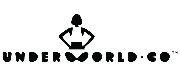
The building block of The Underworld.co (or any brand) is the logo.
The website, packaging and promotional materials--which stem from the logo—all together form the face of the brand.
What helps in creating a logo?
CLARITY OF THE BUSINESS IDEA / VISION
DEFINING THE TONE OF THE BRAND
PARTS OF THE LOGO
Logo-Type
We developed an approachable and fluid typeface--an independent logotype--keeping in mind future category additions.
Logo Symbol
We worked towards achieving an independent and strong logo symbol to make sure it sat independent of the Logo-type, whenever required.
Characteristics of the logo?
FUN & DYNAMIC
MINIMALIST
A peep into the design process of The Underworld.co
BRANDING
The Underworld.co is REFRESHING, BUBBLY AND BOLD.
What helps in maintaining consistency in a brand?
A CLEAR BRAND TONE

Love
Team Underworld.co
The stories behind the prints are designed to wrap you in glee. The choice of fabric and the packaging is consciously designed towards creating a sustainable world, one undie at a time.
